ShopDreamUp AI ArtDreamUp

Deviation Actions


Description
Just one of many pictures I've been trying to get done for ages.
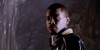
Miranda and Jacob from Mass Effect - set in a hypothetical, speculative period between the end of the 2nd game and the 3rd game. No idea if and how both of them will appear in the final game of the trilogy - just having some, er, fun.
Always thought that the depiction of Miranda that appeared in the official artwork and promo-videos - i.e. anywhere but the game itself, and by depiction I also include Yyvonne Strahovski herself - appeared much more attractive than the model appeared in the game. So I modelled my version of Miranda on those interpretations. Then I feared that I really hadn't captured Miranda so I tried to incorporate some of her in-game features and now I'm fairly sure I've ended up with someone who doesn't look a thing like either the in game model or the real-life actress.
And don't get me started on "Jacob"...
Anyway, hope you likes...
Mass Effect and its characters, property of BioWare and Electronic Arts
Image size
1454x1341px 493.64 KB
© 2011 - 2024 ZedderZulu
Comments7
Join the community to add your comment. Already a deviant? Log In
Disclaimer: I've never played this game, so I'll be judging it on its own merits rather than whether it reminds me of the game or whatever. Just thought I'd let you know.
The biggest thing this drawing needs is more dramatic lighting and coloring. I myself have struggled with remembering to add vibrant contrast and color to my pictures, but sometimes it's what you need to get the emotions across. Specifically, Miranda's face, facing away from a very bright light source, needs to be much darker and have much higher contrast. You might even want to put most of the face in complete shadow with maybe one eyeball, the bridge of the nose, and the lips visible. Similar for the left (from the viewer's perspective), shoulder and neck, leaving the collarbone brighter. The hair also needs work-it looks kind of shapeless and without flow. You've done some work reflecting the sunlight off the rightmost strands of hair, but I think you need to do more of it. You could also use some more contrast between the more visible stands and the darker, less individuated strands behind her head and neck. As for color, human skin isn't limited to just traditional skin tones when affected by light. I'd recommend some dark, muted reds, pinks, and oranges on Miranda's skin in between the darker shadows and the highlights to keep consistent with the sunset theme in the background.
Jacob, on the other hand, already has a lot of this going for him. Notice how the part of the face directly in sunlight is bright and stark, while the part in shadow is dim and unsaturated. You basically need to do that for Miranda, adjusting the lightsource from 'at-an-angle' to "from behind." There's basic lightsource tutorials all over the place, so look for one that details how to shade something lit from behind.
Same with the rocks: let the audience know which parts are hidden from the sunlight by making them much darker. In bright sunlight, shadows can be very dark, so make that come across in your drawing.
The anatomy is mostly good. I'd recommend going for a more 'rounded' look on Miranda between the lips and the sides of cheeks, and the top of the head is too low and flat, judging by where the hair is placed. Jacob is better, although the hairline looks a little false. Short, military haircuts do look kind of severe naturally, of course, but I would recommend blending the hair with the skin a little more, so the hair looks like it's actually protruding from the scalp.